Woodrup
Modernising a classic
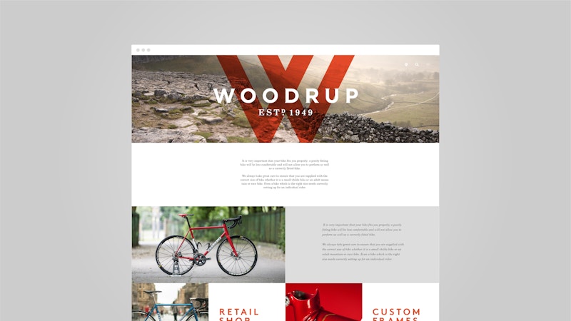
We took a classic cycling brand and gave it new power and momentum, straddling country and city, heritage and modernity.
The situation
Established in 1949, Yorkshire’s best-loved bike company had a reputation for quality and craftsmanship, and multiple Tour de-France and track world wins to its name. But this wasn’t reflected in its brand. Jostling for a position in a crowded contemporary market, Woodrup was at risk of being left behind.
The solution
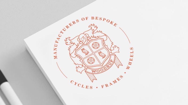
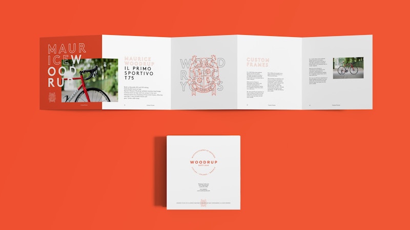
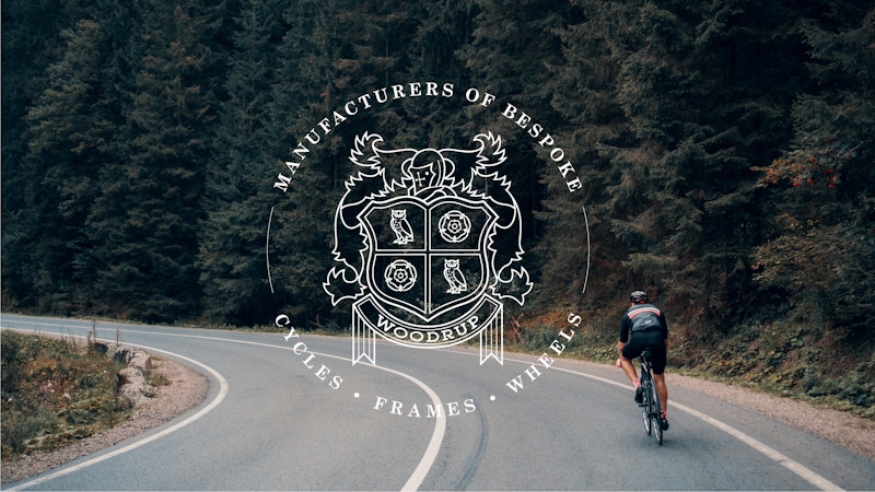
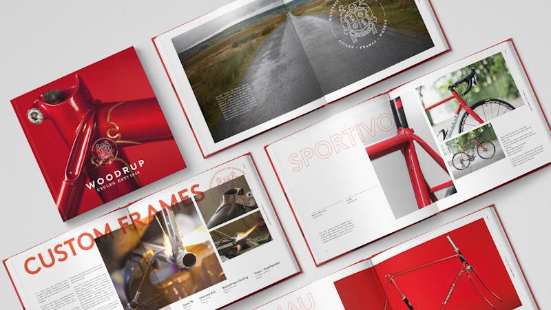
We created a brand that captures everything that makes Woodrup’s heritage so rich. The craft. The landscape. The sport. The stories. And, while respecting and celebrating the past, we readied the brand for the future, shaping an identity and narrative that allowed Woodrup to compete at an international level.
What we did
- Brand strategy
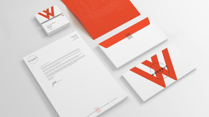
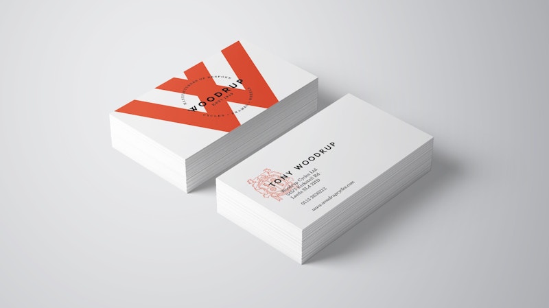
- Brand identity
- Photography

Past, present and future came together in harmony.
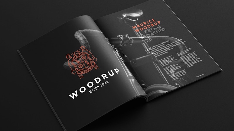
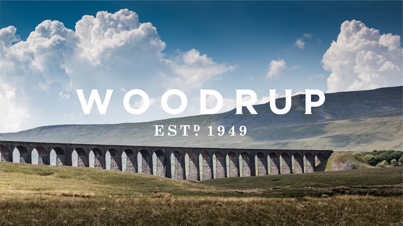
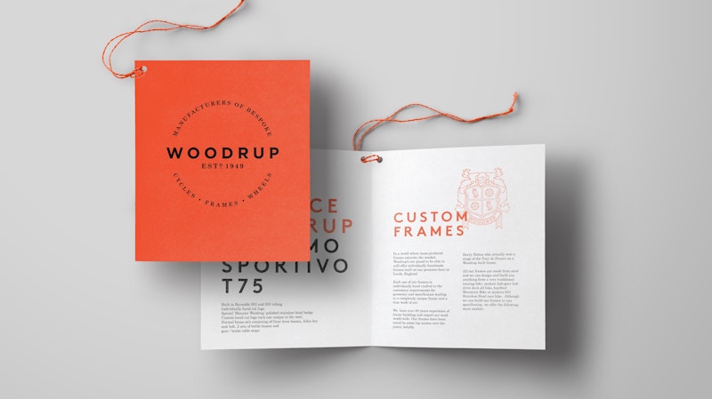
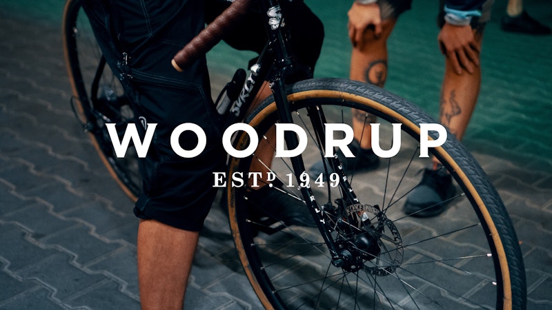
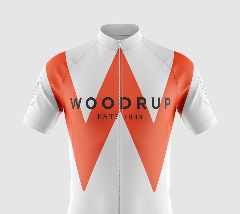
A new custom wordmark was born. Loosely spaced and elegant, with subtle serifs, it evokes a sense of history and tradition while bringing Woodrup bang up to date.
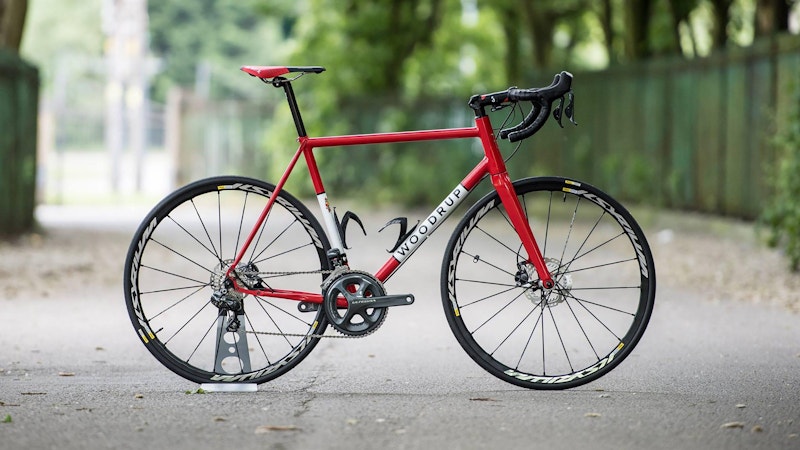
We strove to give Woodrup a brand as well crafted as its bikes, to help the business stay out front.

